Project Description
Joanna & Adam’s kitchen
A breath of fresh air!
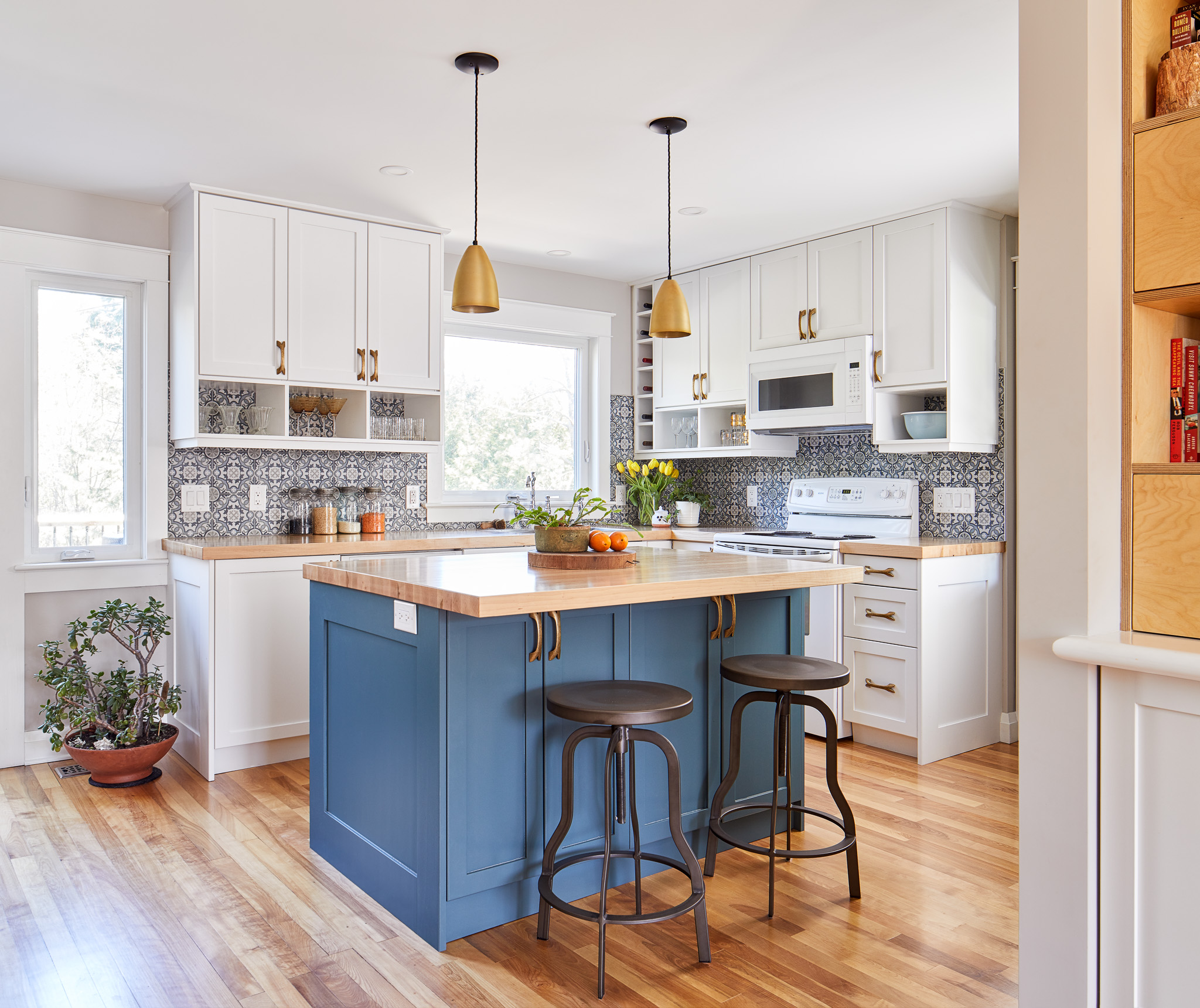
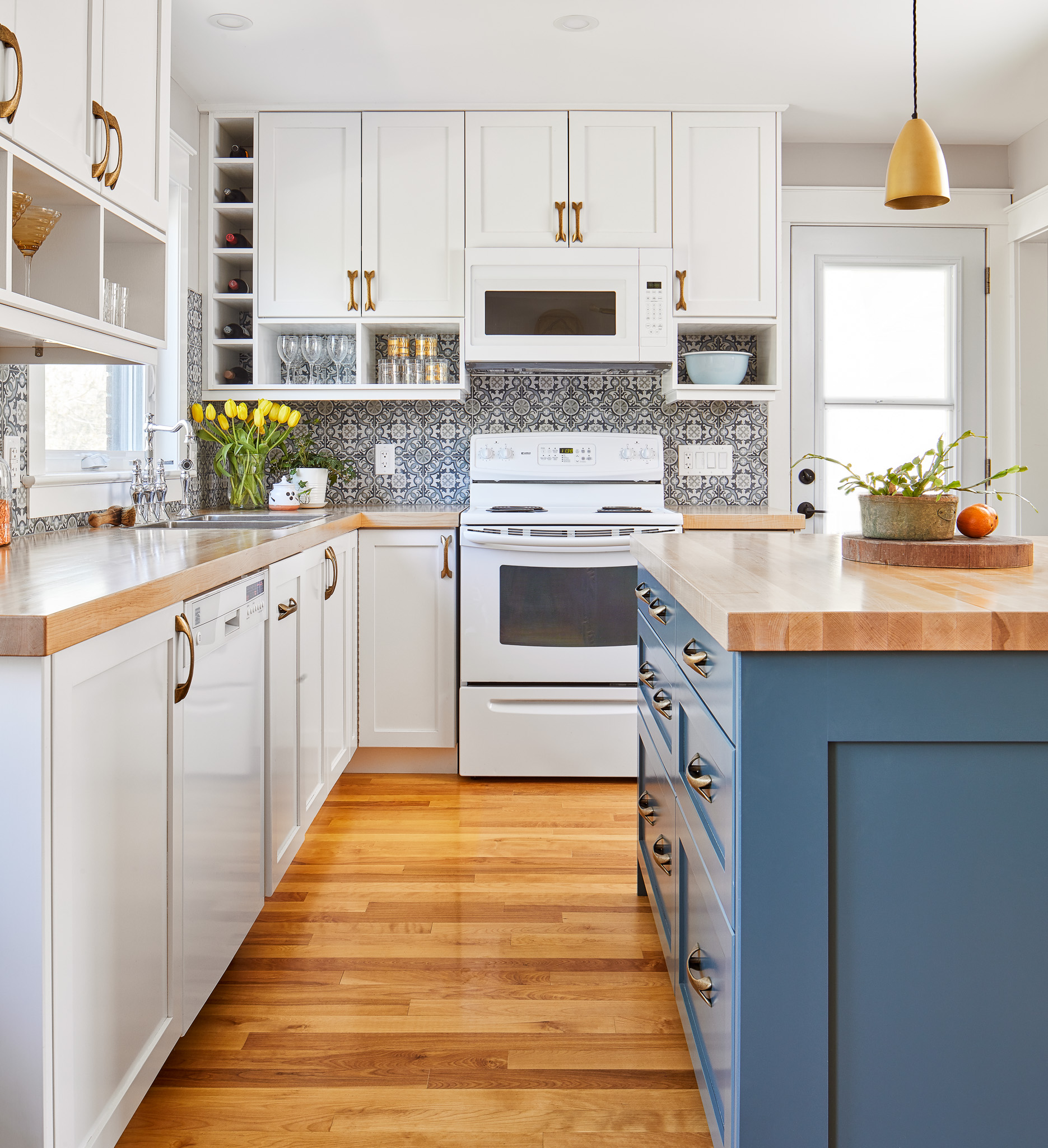
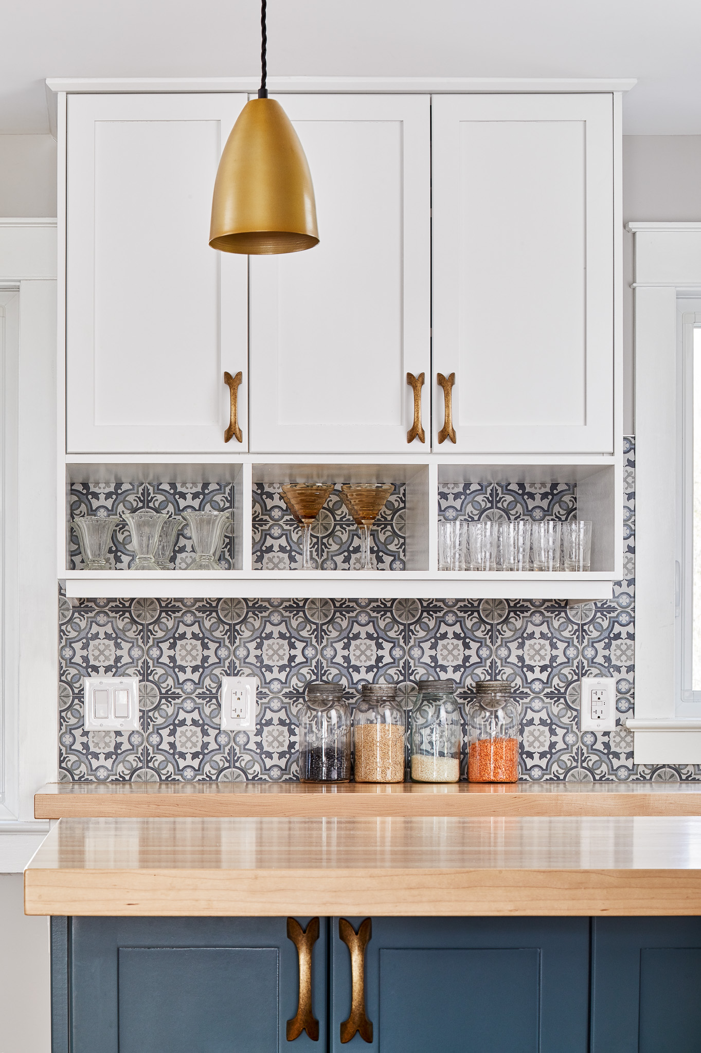
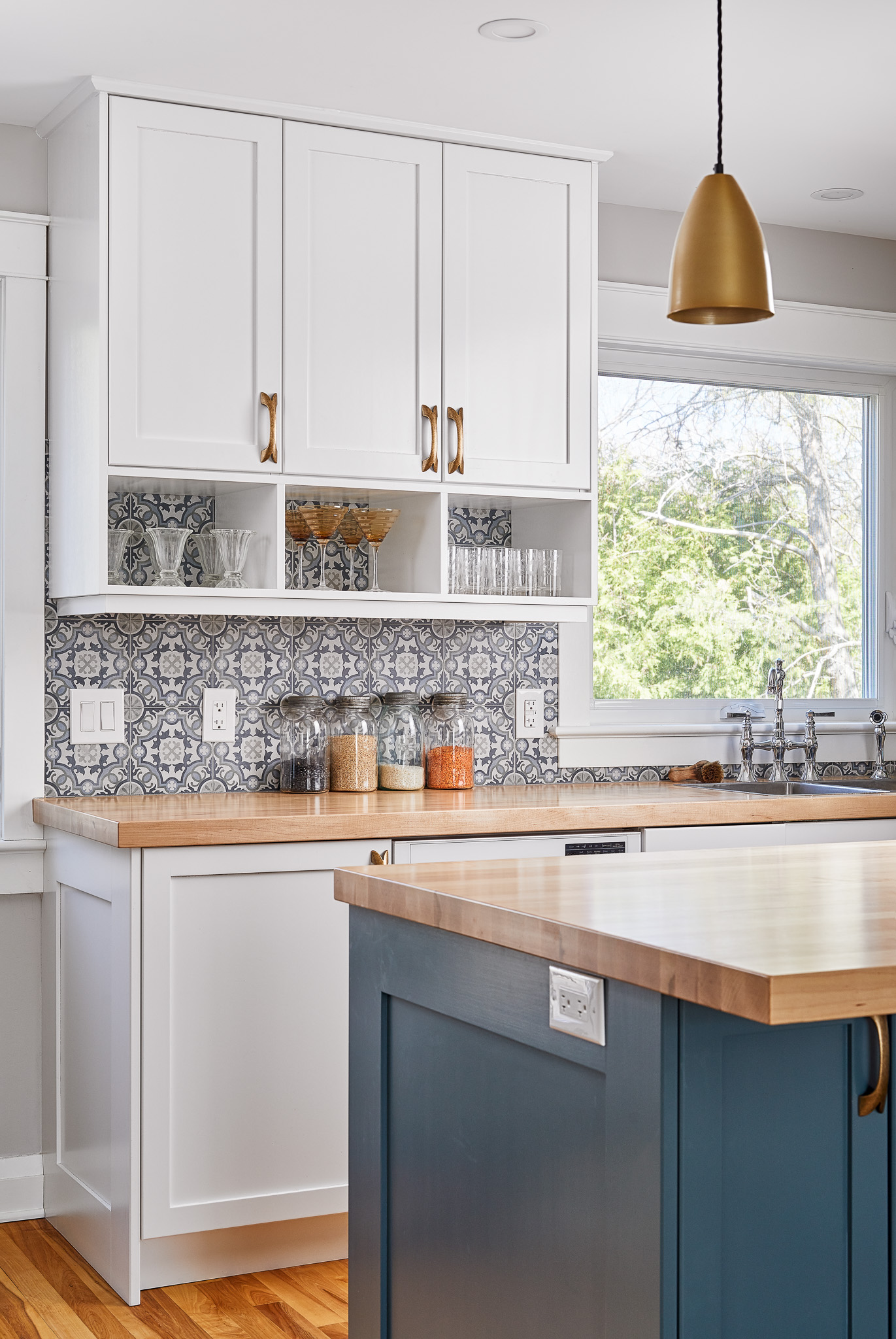
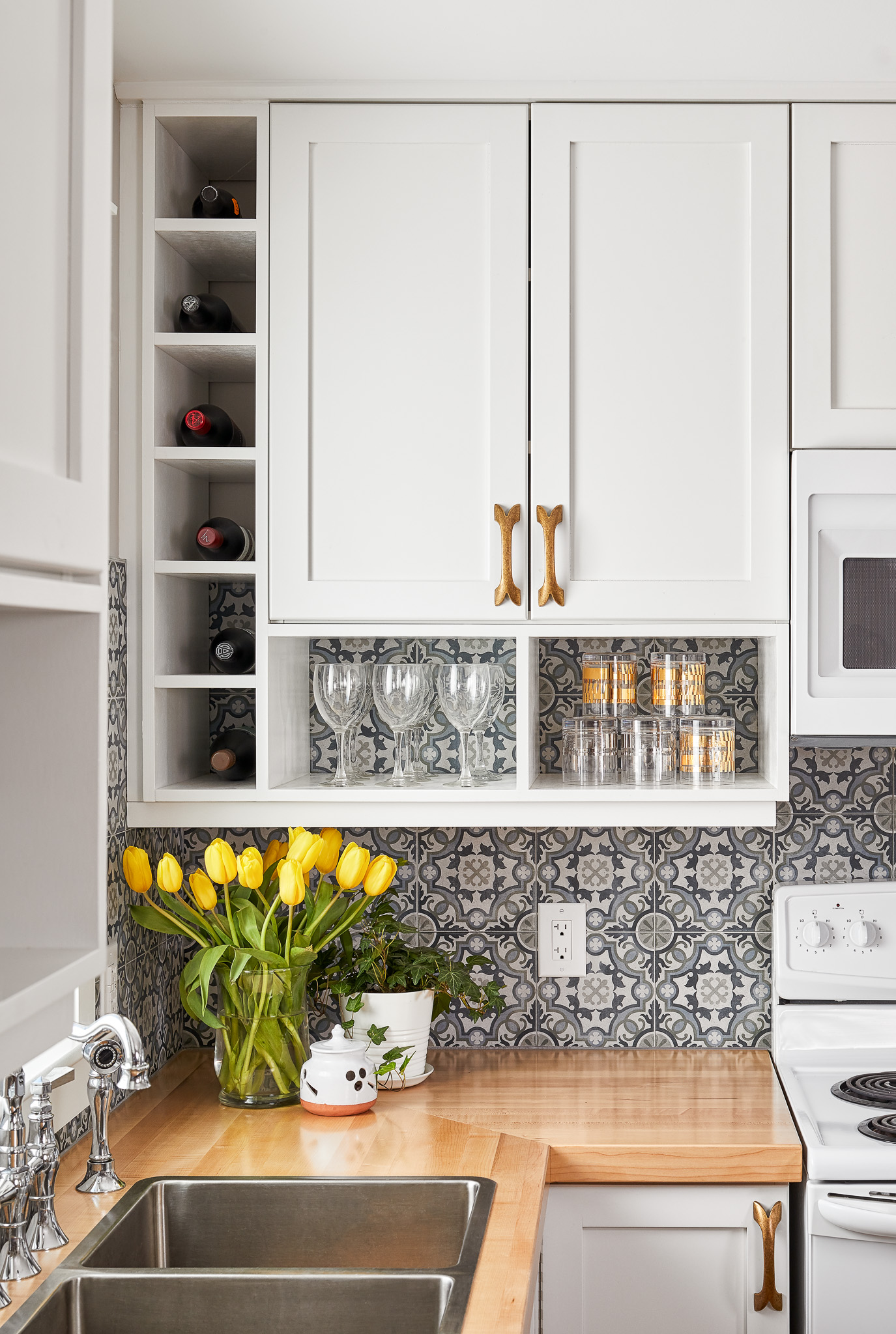
Here is another great example of the transformation that can come from knocking down a wall! A tiny, cramped kitchen was reinvented into an open airy space by removing the wall joining the kitchen and dining room. This allowed for the expansion of counter surfaces, introduction of an island and improved flow for the whole main floor. While not huge on space, the white & blue colour scheme make this kitchen feel like it has lots of breathing room. Blonde woods and brass accents warm up the cool cabinet tones and add an organic feel to the space. In small spaces, smart use of built in can make a huge difference. They reduce the number of small pieces of furniture required for daily stuff and keep clutter contained. In this space, a floor to ceiling unit in the living room houses the TV, radio, books & decor on open shelves and hides craft supplies, cables and other necessities behind doors. Dressing it up with wallpaper at the back makes it feel like it belongs in a living room and coordinating the hardware with that of the kitchen ties the two areas together. A slim cabinet by the front door holds all those things that we are constantly misplacing: keys, phones, Presto passes. When paired with a USB charging outlet and a mirror, it’s a very efficient little command centre for daily life.

